
Customizing Plot Settings
For the previous curve plot, suppose you want to change the default x and y labels, and add a title for it.
To change the default setting for the plot, first, right click anywhere on the plot, a will appear as below.
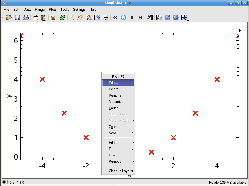
Choose , and the Edit Plot dialog will appear.
To add or change the Y/X label and title of the plot, click on the tab.
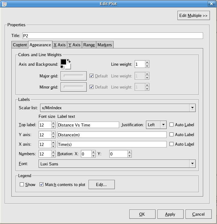
In the textbox beside Y axis/X axis: enter the Y axis/X axis label you want. In this case, “Distance(m)” and “Time(s)”.
In the textbox beside Top label: enter the title for the plot. In this case: “Distance vs Time”. In addition, you can choose the justification of the title by selecting Left, Right or Center in the Justification textbox.
To change the settings of the X or Y axis, such as choosing the scale of the X/Y axis or adding gridlines, click on the X Axis or Y Axis tab.
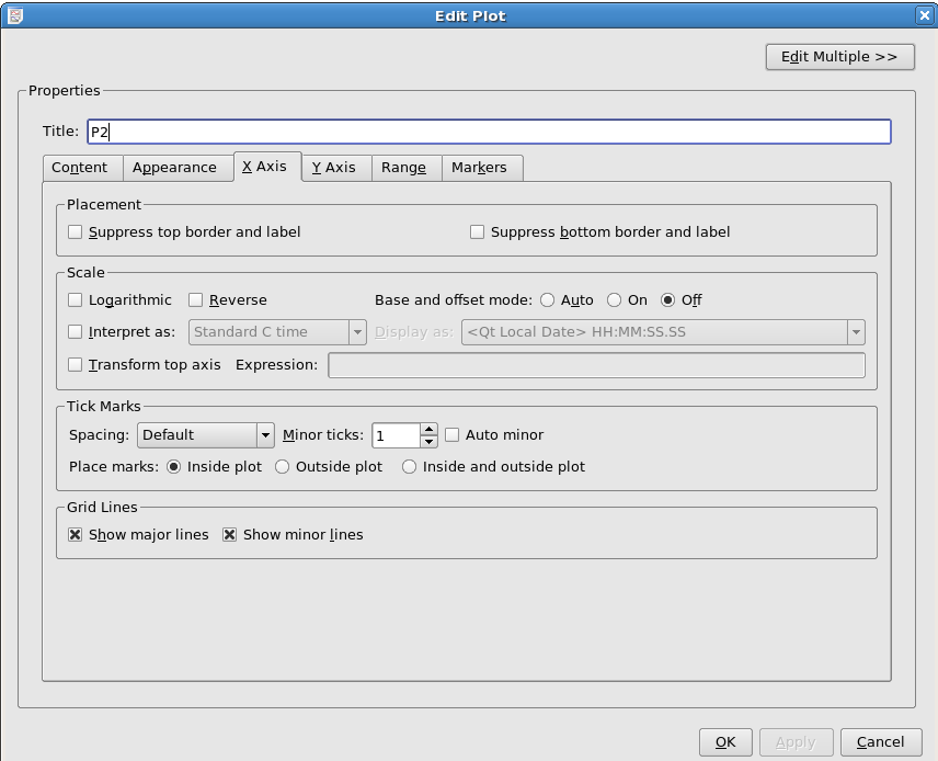
Change the minor ticks of the X axis to be 1, and choose to show both the major and minor gridlines for the X axis.
For the Y axis, for which no screenshot is shown, select Reverse for the Scale, change the Minor ticks to be 1.
To change the range of X or Y axis, choose the Range tab.
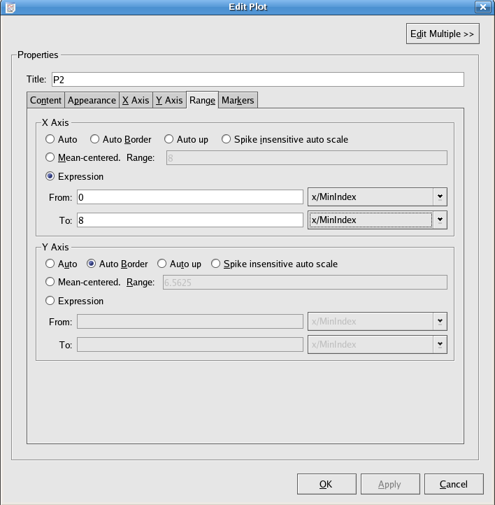
Change the range of x axis to be From 0 To 8.
Finally, you can highlight some important part of the plot by using the Markers tab.
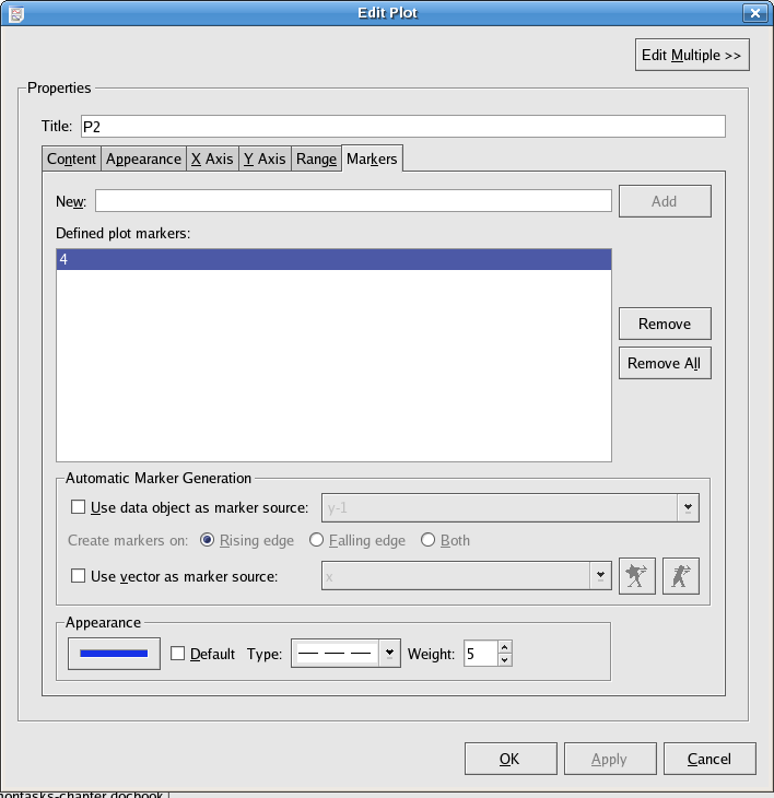
For example, if time = 4 s is important, enter “4” in the New textbox and click on the button. A marker line will appear at the position of time = 4. You can customize the marker line in Appearance. In this example, choose “blue” for the line color, “broken line” for the Type and “5” for the Weight.
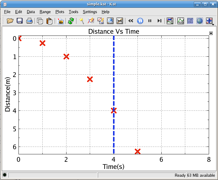
The customized plot will look like this:


Would you like to make a comment or contribute an update to this page?
Send feedback to the KDE Docs Team